Theming
Styling a regular component:
Styling a common component:
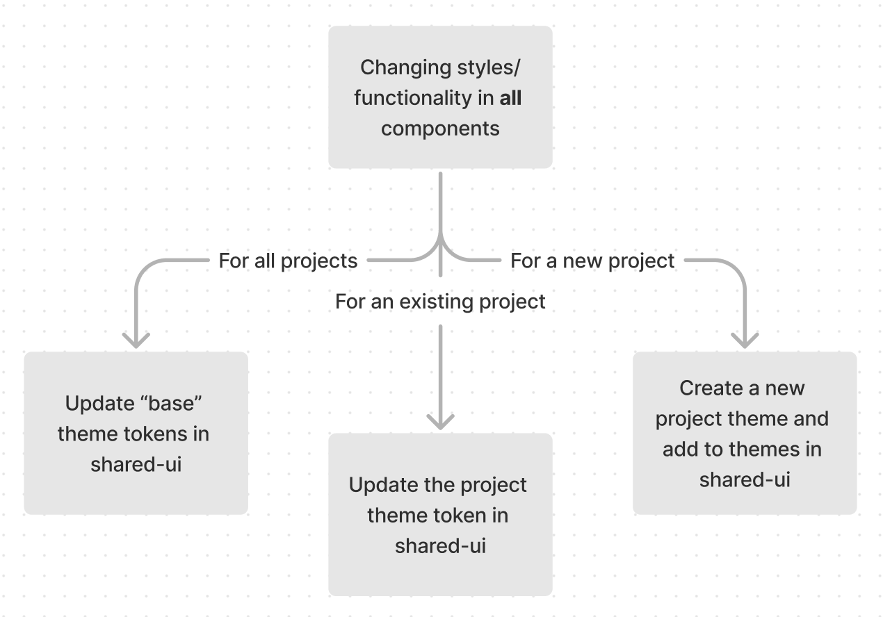
Styling all components:

Updating a project theme:
- Make a post in the
nextsteps-frontend slack channel with the change you intend to make. This helps all devs to anticipate the change or offer alternate solutions to the issue.
- Go to
/libs/shared/ui/src/libs/themes. Each folder (eg base, website) are project themes and contain a tokens folder.
- Update the appropriate file in
tokens and check the theme stories are correct and capture your update. See mui documentation for the palette, typography and component tokens.
Creating a project theme:
- Create a material theme
- Use the
breakpoints and spacing theme tokens from base in every new project theme. See libs/shared/ui/src/libs/themes/website/theme.ts for an example.
- Update
index.ts in /libs/shared/ui/src/libs/themes with the new theme name.
export enum ThemeName {
  ...ExistingThemes,
  newTheme = 'newTheme'
}

// Add within getThemes()
 const themes = {
    ...ExistingThemes
    newTheme: {light: newThemeLight, dark: newThemeDark}
  }
